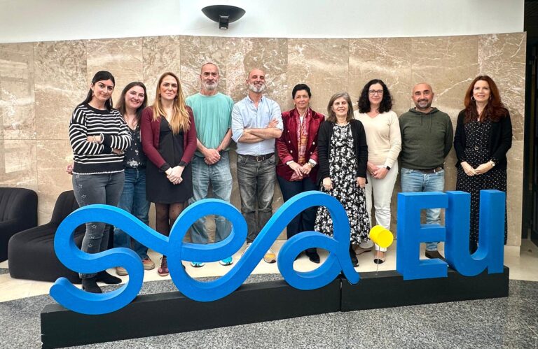
Last June, the SEA-EU alliance presented its rebranding and communication strategy, which brought with it a visual change for the Turquoooise project.
The new identity of the consortium, which was carefully conceived, wanted to capture the very essence of what the Turquoooise sub-brand stands for through the new logo. Although at first glance it does not appear to be a drastic change, our graphic image is easily identifiable. The colour choice in the title is a direct visual representation of what the Turquoooise project means, green/blue, duality of the master’s title.
This rebranding also represents the expectations of the future programme. Our proximity to the sea means that we recognise the importance of a “blue-green” approach in the development of society and can allow us to now find answers to management issues in an ever more uncertain environment.
Behind the management model we wish to create—is also an acronym with the following meaning:
Transition to Uncertainty by Revising, Questioning, and Unsettling Objectives, Outcomes, and Operations Integrating Sustainability in Education
This creative process is just an initial glimpse into the exciting journey Turquoooise is embarking on. Its impact is not only limited to the aesthetic but it is hoped that this evolution will revitalise public perception in order to promote the future Master’s programme, whose ambition is to obtain Erasmus Mundus Joint Master status.


